Globoplay
Globo.com
YEAR: 2018 - 2020
ROLE: DESIGN LEAD / PRODUCT DESIGNER
Crafted with dedication by an extraordinary team of designers and innovators.
ABOUT THE PROJECT
2019 was a pivotal year for Globoplay, which became an all-in-one service with the launch of Globoplay + Channels. Grupo Globo's response to the fragmented streaming market added live TV to its existing video-on-demand (VOD) offering.
ABOUT GRUPO GLOBO
Grupo Globo is the largest media conglomerate in Latin America, renowned for its extensive portfolio of television, radio, print, and digital media. As a leader in audio-visual production, Globo has consistently pushed the boundaries of innovation in the media landscape.
As the Product Design Lead for Globoplay, I was responsible for the overall user experience of Brazil’s largest streaming platform, serving over 30 million users. My role involved strategic decision-making, team leadership, and stakeholder alignment, ensuring that our solutions met both user needs and business objectives. I focused on driving user research, product strategy, and collaborative processes to deliver a seamless experience, while managing the integration of design, development, and business goals to keep Globoplay at the forefront of the streaming market.
VOD + linear television channels all together
VOD and linear television channels, all in one place. Globoplay, as a VOD platform, aggregates a vast range of content, from TV shows and movies to novelas, offering both in-house productions and international content through partnerships with major studios worldwide. The challenge grew when we introduced linear TV channels alongside this content. Our mission was to seamlessly integrate everything, enhance discoverability, and reduce churn while delivering a unified experience in this new tier.
Brazil’s first all-in-one streaming service
How increase the time and frequency of users on mobile devices?

Giving visibility to a variety of content and formats
The various research studies on video content we conducted a year earlier provided valuable insights for designing the new tier. In addition, we needed to address business challenges by analyzing service usage data, user habits, and churn.
Some key concepts we had in mind:
VOD content:
- Catalog variety is a key metric for users when considering a streaming service subscription.
- Users highly value connecting user preferences and habits with personalized recommendations.
- Watching beyond trending titles is an important factor in reducing churn.
- Users who engaged with more than one device had lower churn rates.
- Smart TV users watched more hours, explored a wider variety of titles, and had lower churn rates.
Linear television channels:
- We could minimize the paradox of choice since "what to watch" is curated by a third party.
- Live content, such as sports and news, holds varying importance for users. It must be easily accessible to avoid frustration from missing key moments.
- The ability to "go back in time" (start over or reverse EPG) is highly appreciated by users.
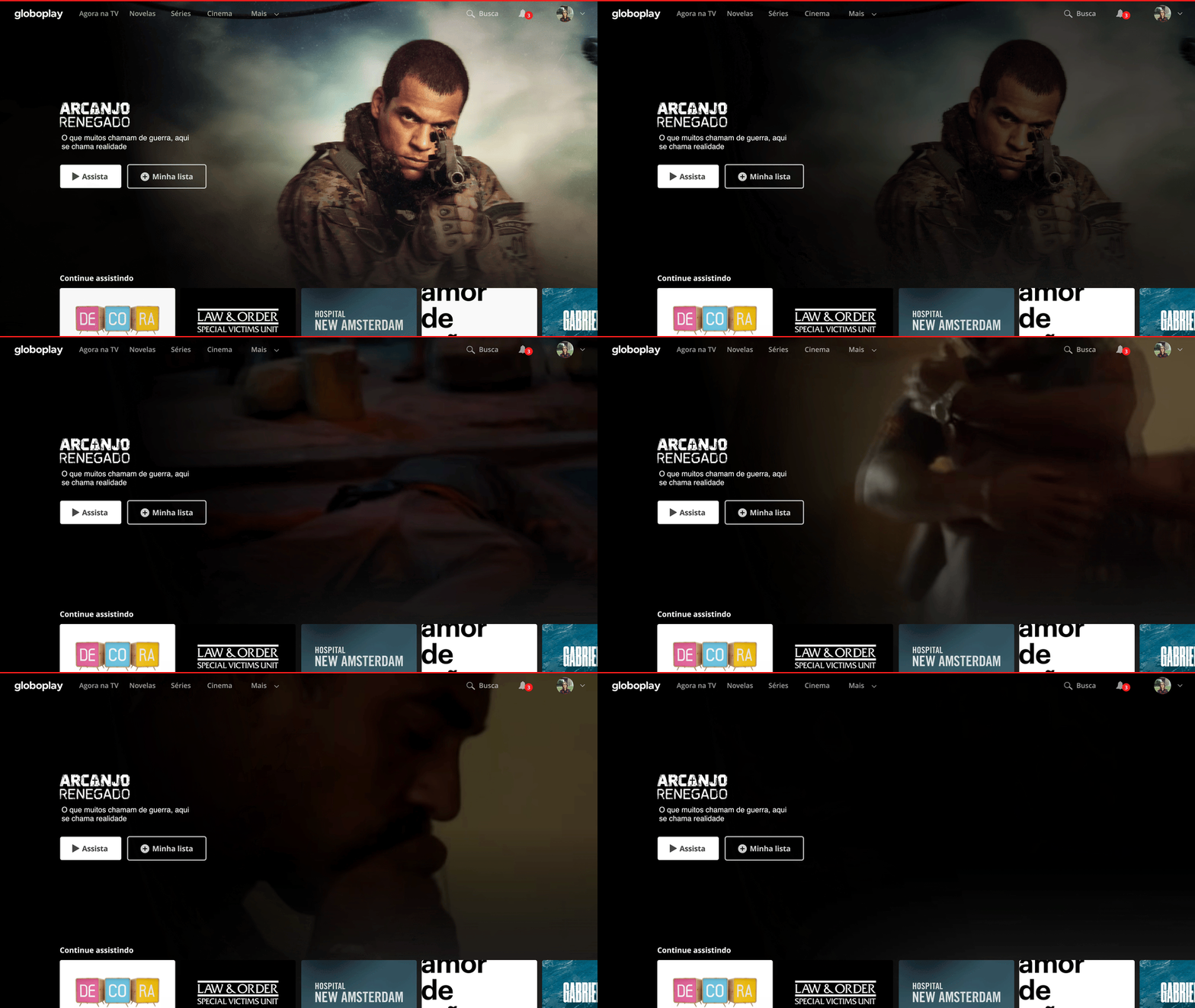
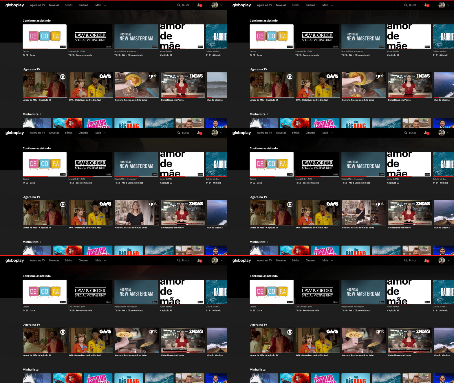
Differentiating VoD of live streaming with movement
Four pillars guided our paths
While VOD is represented by the title cover, live content is represented by the video itself, creating a sense of time-sensitive content. Since channels showcase a variety of titles, it helps users quickly scan their interests while the video is playing.

Mixing editorial expertise with AI
Four pillars guided our paths
To drive users to explore content beyond just trending or new releases, we had to combine editorial expertise with AI. The business need was to ensure that a broader range of content would be surfaced, allowing the catalog to rotate more effectively. By mixing curated editorial choices with AI-driven recommendations, we created an environment that balanced user interests with the business goal of maximizing content discovery. The building block structure we developed allowed us to generate unique homepages tailored to both user preferences and tier type, ensuring fresh content was consistently featured.
Thematic navigation to discoverability
Four pillars guided our paths
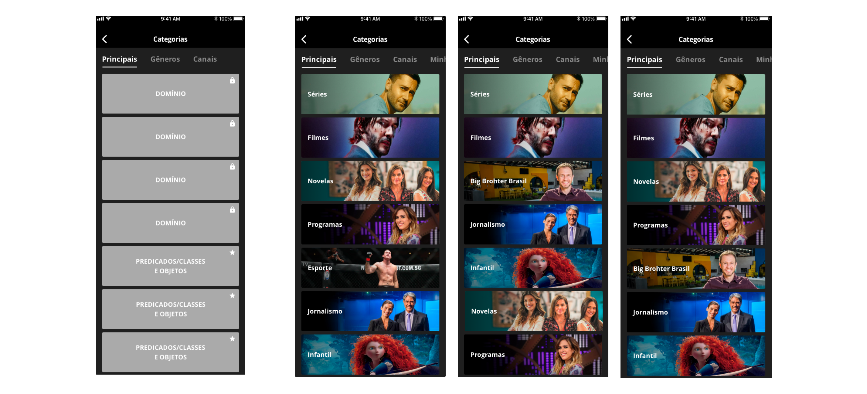
Enabling users to discover new content was a challenging task that made us rethink the navigation we were offering. Our previous navigation was organized by content types: TV shows, movies, novelas, journalism, and sports. These were like isolated categories with no overlap.
This structure didn’t reflect real-life interests. Themes, genres, and emotions go beyond the rigid types we were presenting. We needed to connect users with the stories we offered, and stories are inherently multi-thematic.
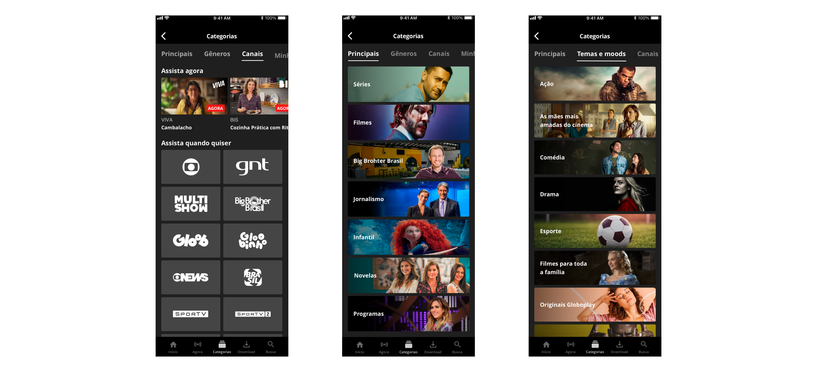
Drawing inspiration from successful platforms like Netflix and Spotify, which invested in multi-thematic navigation to help users discover new content while showcasing the diversity of their catalogs, we decided to invest in new navigation and updated metadata.
After several experiments, this is the navigation system we created.


Things I've learned from Globoplay + channels
Four pillars guided our paths
Keep the developers close, keep the data science team even closer
Staying close to people who "speak machine" is crucial for designers if you want to deliver not just amazing assets, but exceptional final products. However, if you aim to innovate, this becomes even more critical. To scale problem-solving, it's essential to collaborate with those who understand how the machine works, how data works. You need to create together to go the extra mile and bring stunning results to life!
When managing numerous stakeholders and differing interests, it’s essential to design a partnership with them. Design is in every detail.
Using my skills as a designer to shape my relationships with the various stakeholders in this project was key to its success. Listening to their input and involving them in the creation process helped keep everyone aligned. I shared data, benchmarks, trends, and research transparently. I couldn’t be seen as someone disrupting their workflow, but rather as someone enhancing it, with the goal of fine-tuning our efforts to deliver the best possible user experience.
Fostering Growth Through Collaborative Leadership
Mentoring and guiding the design team was central to ensuring the success of this project. By fostering a supportive environment, I was able to cultivate the growth of the designers while upholding the high standards we set for quality. I approached team leadership with a collaborative mindset, engaging the designers in open discussions during design critiques and workshops. This collective approach helped maintain alignment within the team and across departments, ensuring that our goals and deliverables were consistently met through shared ownership and a unified vision.
Designing for multiple platforms requires a clear and strong understanding of what’s important and how these platforms work.
From the information architecture to interactions, it's crucial to consider the usage of each platform, the role they play in the user journey, and the context in which they are used.
Having a holistic view is essential to building a product that tells a cohesive story.
As the lead on this product, one of my key responsibilities was to keep the designers aligned with the overall goal and informed about the broader initiatives, even while they focused on their specific tasks. Without a global vision, it would have been impossible to create a unified product. Likewise, without designers dedicated to each strategic part, building the high-level features we achieved would not have been possible.
Let's talk? [email protected] • Linkedin • Twitter