Rethink News Consumption
Globo.com
YEAR: 2015-2018
ROLE: INFORMATION ARCHITECT/ UX DESIGNER
Rethink News Consumption
Globo.com
YEAR: 2015-2018
ROLE: INFORMATION ARCHITECT/ UX DESIGNER
Rethink News Consumption
Globo.com
YEAR: 2015-2018
ROLE: INFORMATION ARCHITECT/ UX DESIGNER
ABOUT THE PROJECT
The project started in 2015 with a mission to rethink news consumption on mobile devices for the entire globo.com portals. My role as Information Architect / UX designer on this journey was to project this whole new consumption experience along with visual designers, product owners, and developers.
ABOUT GLOBO.COM
Globo.com is the technology branch of Grupo Globo, the largest mass media group of Latin América. I'm part of the platform team, where solutions for the whole company - especially for the main brands: G1, GShow, and Globo Esporte - are designed.
The Challenge
Our projections showed that in a short period of time, our mobile access would be higher than our desktop's. Since our mobile experience was never adequately thought, we had to identify the issues on our mobile experience consumption and how we could fix them.
The project had three basic requires: Data-driven design, mobile first and fit efficiently to the main brands: G1, GE, and GSHOW.
Discovering the real problem
The numbers were our best friends at this point; we needed to understand the real impact of the growing mobile share in our products.
- Social referral is bigger than ever: Google + Facebook represent a bigger referral than Globo.com's homepage for all products. The "point zero of our experience isn't ours anymore
- Our homes are less relevant in the mobile scenario than in desktop. The main function of them is branding and strategic positioning, not traffic-driver for content
- Content pages are the new landing pages
- Time and frequency on the mobile are smaller than on desktop
How increase time and frequency of users on mobile devices?
How increase the time and frequency of users on mobile devices?
Four pillars guided our paths
Four pillars guided our paths
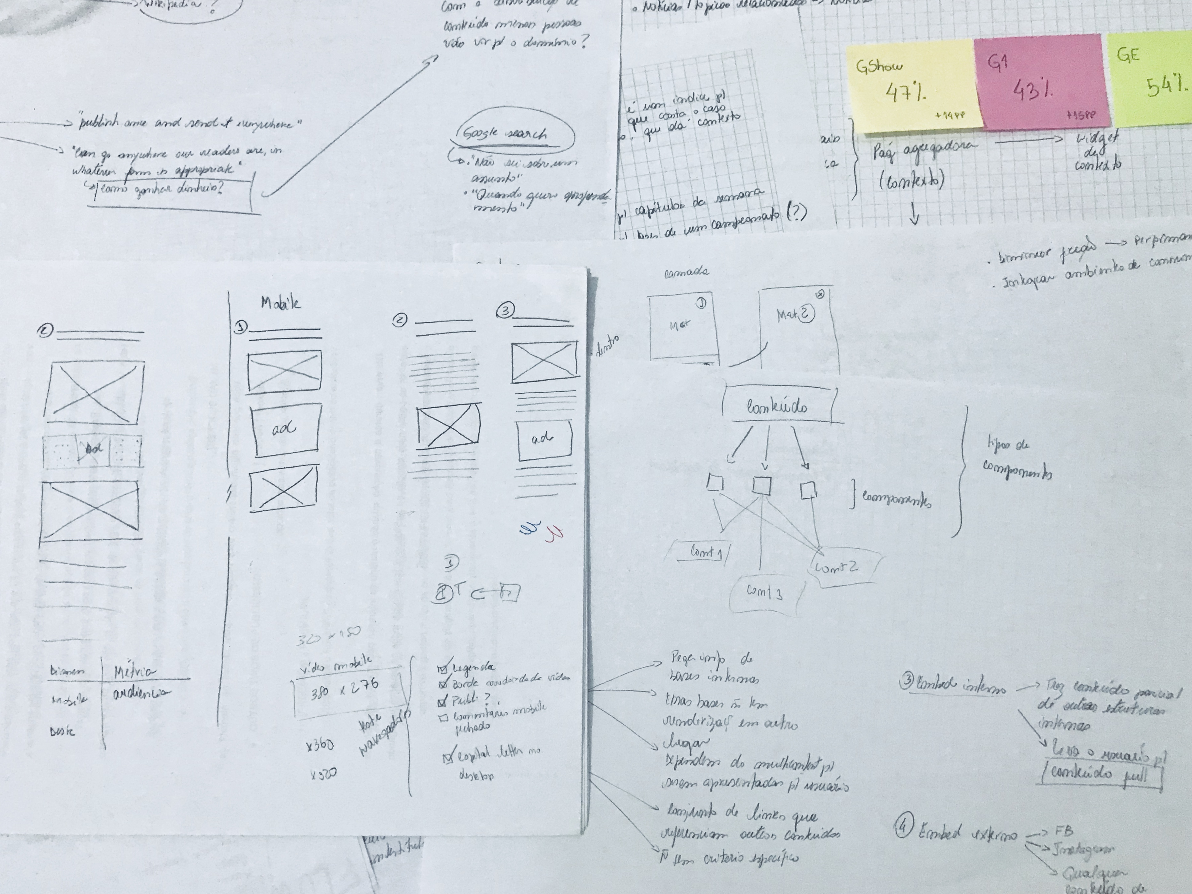
1. Content - Create for the chunk, not the page
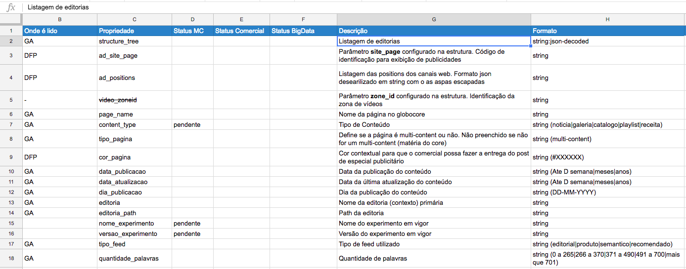
Mobile is all about the user, means context: where I am, what I am doing. To deliver this personalized experience and distribute content we need to produce structured content and meaningful metadata.
We decided to abandon the WYSIWYG way to create and embrace the adaptive content methodology.
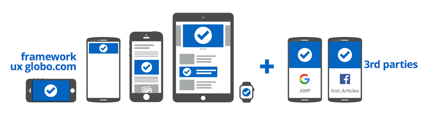
This change meant a challenge to create a new publishing platform capable of serving this content. A capability to personalize content according to user behavior/ clusters and distribute our content - not only in our site but the third-party platforms (Instant article and AMP) - and a total change of culture for editors.
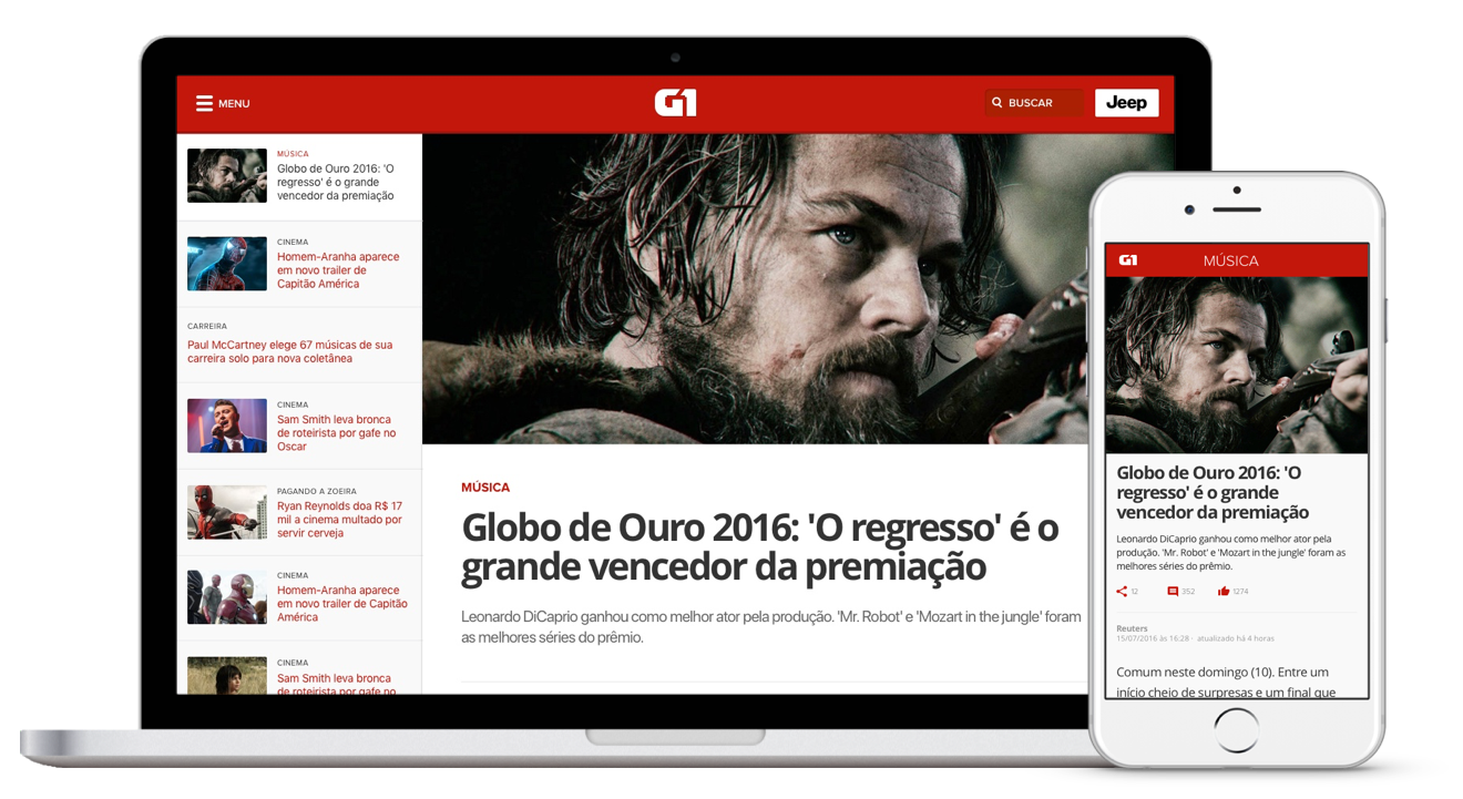
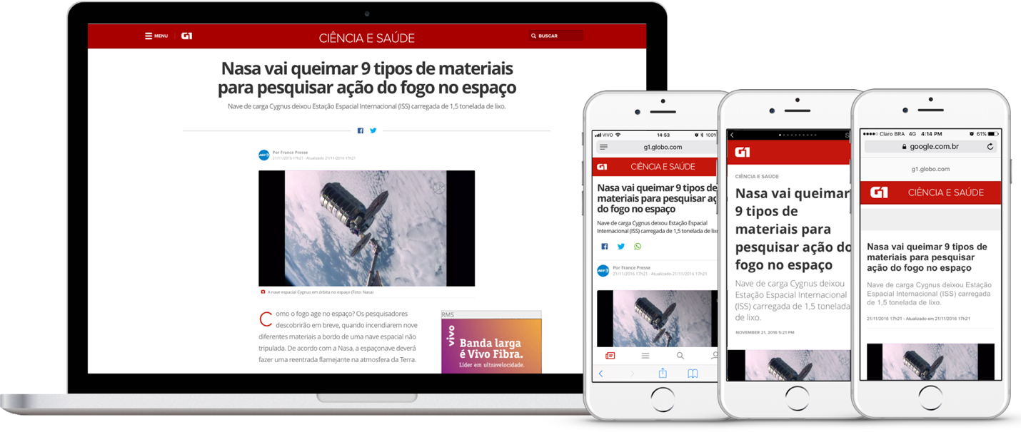
Same content, different touchpoints
2. Engagement - Attention, the precious commodity
Newsfeed
Homes were known as traffic-driver for full content, but since they are not the main landing page anymore, we need give to the content pages one more responsibility. The equation here was pretty simple: our homes recently changed the way to deliver content, now it's done by a News Feed, and the results were very optimistic increasing pageviews per sessions and time on page.
Why don't use this system to delivery News in the content pages too?
Context + Metrics
One of the most important parts of the engagement equation is attention, for us it means to read. And that's the problem; we operated by the rules of average time on page, bounce rate, pageviews, the traditional metrics. We didn't know much about how the users interact, engage with each part of the content. We don't know how they read.
All ours unanswered questions became a measurement plan based on all the additional information that we need: the time users spend in every chunk, every piece of content and their interactions.
Every track has to be followed by a reason why. What are the question it will help us to answer?
3. Monetization
Our ad units on mobile were very different from the desktop which was a historical problem to our advertising team, to turn our business competitive we redesigned all mobile ad units using IAB guidelines and the placements were thought according to market case studies and best practices.
All these changes took us to work in a cross screen/channel model of advertising and allowed us to pay attention to important things like viewability (metrics and optimization), and personalized ads.
Ad Placement according to the size of the article allows us to control the ads density and improve the experience
4. Performance
As fast as we can
Instant article and Accelerated Mobile Pages (AMP) were a clear response to old problems: heavy pages and long load time. The responsibility of this optimizations passes thru developer and UX team. For developers, the challenge is to build lean codes, services, and requests. For my team, the responsibility is to create every element, every feature following functions.
We analyze every performance data; we rethink every interaction, element, font, and color. We pulled off every unnecessary thing. The focus was to build a simple and clear page, where the content is the real star.
Be fast, look fast
Performance is about optimization but is also about perception. Based on user behavior observed in previous usability tests, we prioritize elements based on reading movements and build a first paint logic to implement in our pages.
The final draft - Always a work in progress
Almost three years after the beginning of the project and two years after project launch, our data analysis showed us the results of all deep studies and improvements we did on the framework (Multi-content + News Feed): we improved in 25% the time per user on our products/ brands.
Let's talk? [email protected] • Linkedin • Twitter